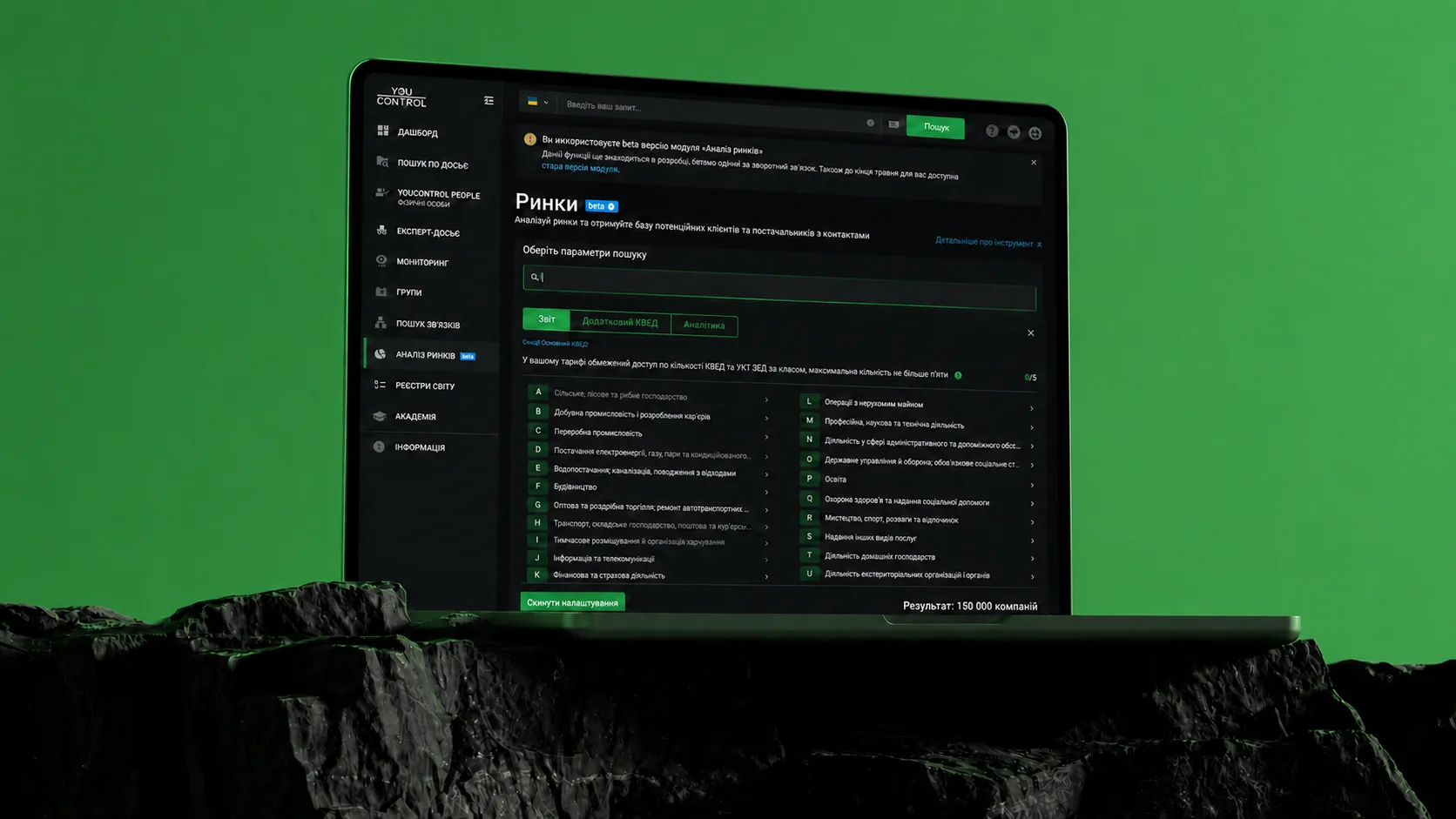
The product idea grew out of a request from marketers at existing YouControl customers: they needed company lists by industry (KVED), with contact information for B2B prospecting.
Developers prepared the selection manually. The request sparked the team’s idea for a dedicated tool that would let business users find relevant companies themselves.
The design task was to turn that service into a reusable product flow, from setting the criteria to working with the resulting companies.
MY ROLE
FROM RESEARCH TO DEVELOPER HANDOFF
I was the sole designer on the project. My responsibilities included product discovery, UX strategy, information architecture, user flows, wireframes, UI design, prototyping, and design QA.
Working to a tight timeline, I focused on the core MVP flow: finding companies, exploring market analytics and exporting results.
Translate registry terminology into plain language.
Public registries maintained by Ukraine’s tax authority determined the available data and search criteria. The design challenge was to make them understandable to business users while preserving the accuracy of official classifications.
DESIGN PROCESS
01. DISCOVERY & RESEARCH
Discussed the problem with stakeholders and the customer representatives who had requested company selections. These interviews helped clarify how they planned to use the data, which selection criteria mattered and what information they wanted to see in the results.
DESIGN PROCESS
02. WORKFLOW MAPPING
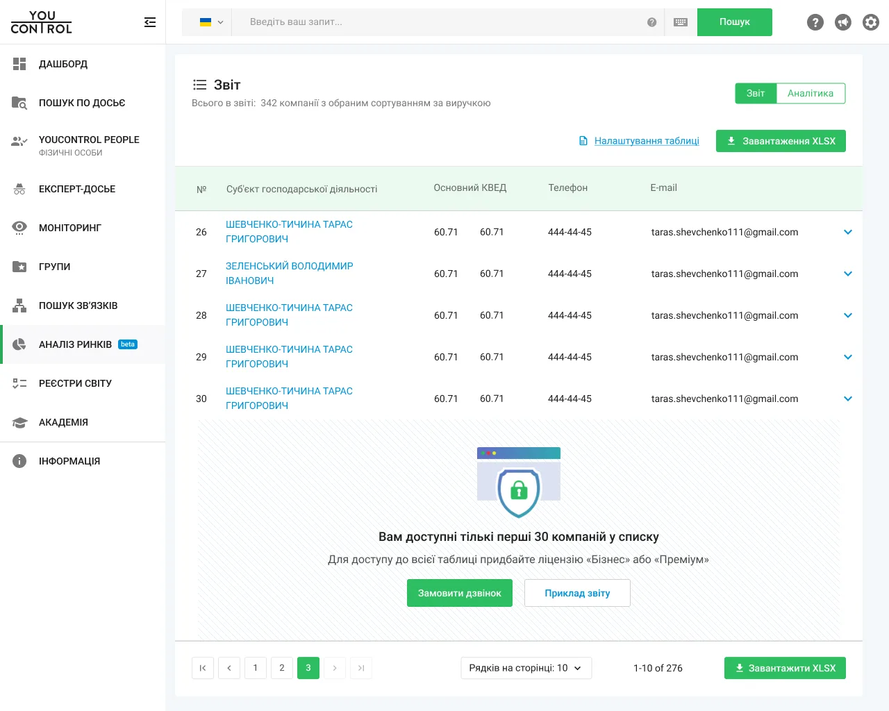
Mapped three stages: select an industry and refine the criteria, explore market analytics, then open a report with company data and contacts. I also designed access limits for the free plan.
DESIGN DECISION
01. FROM INDUSTRY SELECTION TO A TARGETED SEGMENT
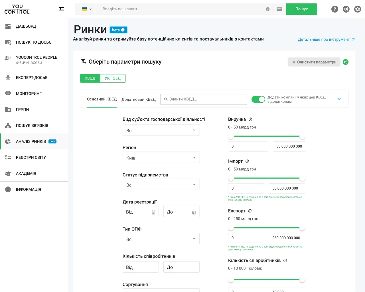
Users needed company lists for a specific industry, so KVED became the primary filter. Additional criteria let them narrow the selection within that industry.
KVED is Ukraine’s classification of economic activities: a system of industry codes used in business registration and tax reporting.
Within the selected industry, users refined the selection with additional filters: company status (active or closed), region, headcount and revenue.
DESIGN DECISION
02. GIVE EACH ANALYTICS VIEW A CLEAR QUESTION
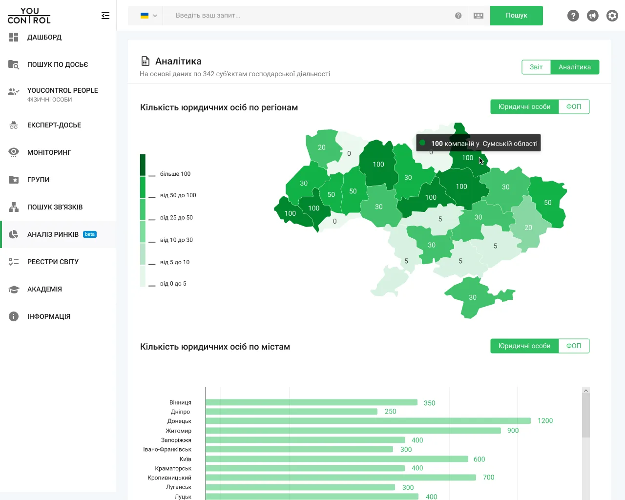
A company table provides individual records. To make the selected segment available as an overview, I designed complementary geographic and financial views.
Where are companies concentrated? A regional map shows geographic distribution, with a city bar chart for comparing locations.
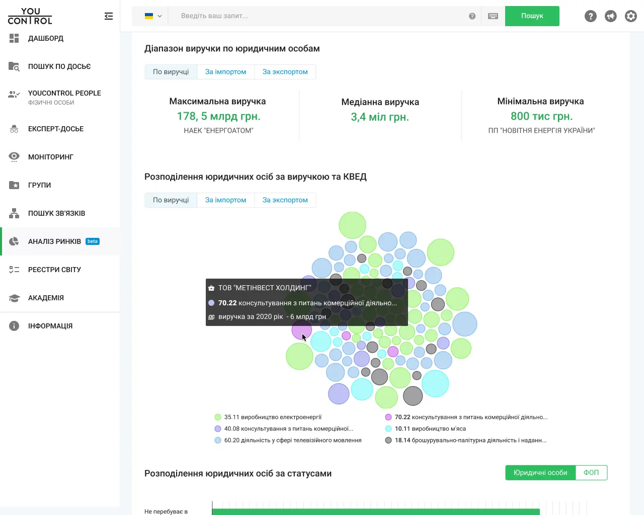
Which companies stand out by revenue? A bubble view presents relative company size and industry groups.
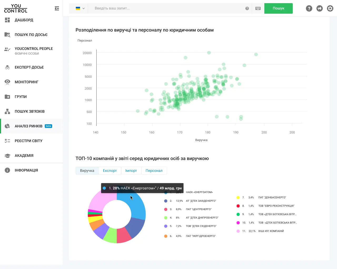
How do revenue and staffing relate? A scatter plot places companies on both dimensions for inspecting clusters and outliers.
How is revenue shared across the segment? A distribution view shows leading companies alongside the remainder of the selection.
DESIGN DECISION
03. A REPORT FOR WORKING WITH COMPANIES
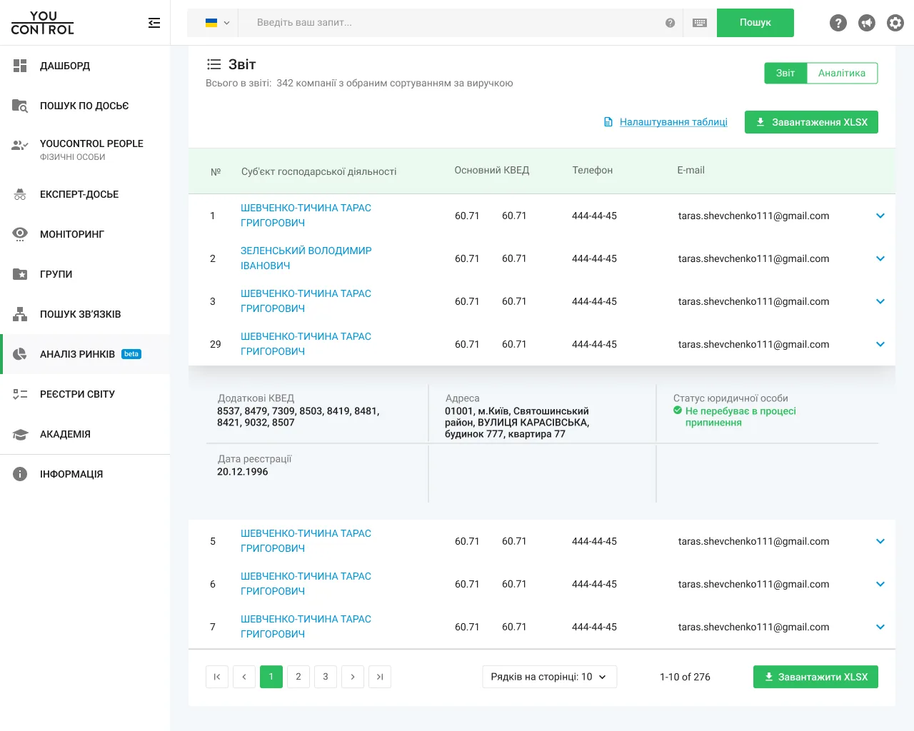
The detailed report provided individual company data and contacts for further research and B2B outreach. Users could download a report for their selection.
USABILITY TESTING
USERS DID NOT ALWAYS NOTICE DEEPER LEVELS
I tested the prototype through tasks covering company selection, report downloads and interpretation of analytics, then presented the findings to the team.
For the first version, we used the filtering approach on Ukraine’s tax authority website as a starting hypothesis. KVED levels opened through successive menus. Users could select broad categories or narrower subcategories, but testing showed that they did not always notice the option to refine their selection further.
We revised the activity selector to show all three levels of the KVED hierarchy at the same time. This made the nesting visible and helped users choose the level of detail that suited their search.
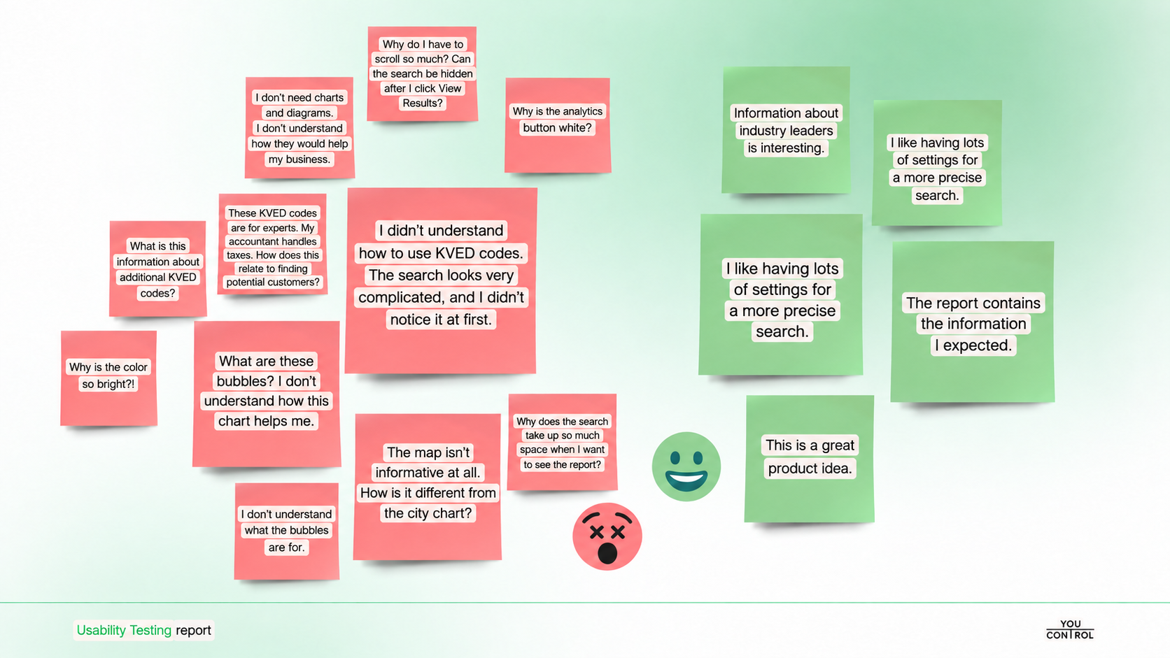
Some participants also found the registry terminology unfamiliar. Small-business participants did not always understand how to read the analytics charts or how the views could help with their tasks. The bubble chart remained in the MVP; this feedback highlighted the need for further validation of its clarity and practical value.
The large filter form made reaching the results cumbersome: participants wanted less scrolling and a way to collapse the search after generating a selection.
Participants also valued the detailed settings for precise searches and noted that the report contained the information they expected.
In a follow-up usability test, 7 of 8 participants completed the tested tasks without assistance.
Participant feedback From the usability testing report, May 2021.